If you’ve been following Calgary real estate, you’ve probably noticed how mixed the messaging has been.
Some people talk about bidding wars and homes selling in days. Others say buyers finally have room to negotiate. Both can be true — depending on the community and the property subtype.
Looking at the city as one market no longer works.
Using a full year of Calgary MLS semi-detached sales data from January 1 to December 31, 2025, this article breaks down:
- where semi-detached sellers clearly had the upper hand, and
- where semi-detached buyers had more time, choice, and flexibility.
The goal isn’t to predict the future.
It’s to help you understand where leverage actually existed — and why that matters if you’re thinking about buying or selling a semi-detached home.
Why Calgary Feels So Confusing Right Now
One of the biggest frustrations for buyers and sellers is that advice often sounds contradictory.
That’s because city-wide averages hide what’s really happening at the community level — and it varies by property subtype.
In 2025:
- Some communities saw semi-detached homes sell quickly with limited inventory.
- Others built selection through the year, giving buyers more time and negotiating room.
- Price movement didn’t show up evenly — even where the pace of sales was strong.
Once you zoom in by community (and keep the property subtype consistent), the picture becomes much clearer.
Three Simple Signals That Explain Most of the Market
Rather than getting technical, this analysis focuses on three practical questions buyers and sellers already ask.
Want the technical version? Here’s how the data maps to the three signals.
This article keeps the language simple on purpose, but the rankings are grounded in completed Calgary MLS® transactions from Jan 1–Dec 31, 2025. Below is how each of the three practical signals is measured using MLS data.
Signal 1: Are homes selling quickly, or sitting?
This signal reflects market tightness — how quickly demand absorbs available supply.
- Months of Inventory (MOI, 12-mo absorption-based): compares average active listings (month-end snapshots) to the annual sales pace. Lower MOI indicates tighter supply pressure.
- Days on Market (DOM, mean): how quickly sold listings moved from listing to sale. Lower DOM suggests buyers were acting faster.
- Sale-to-List behaviour: consistently firm sale-to-list ratios reinforce that listings were not sitting long enough to require concessions.
Signal 2: Are homes selling close to asking price?
This signal reflects negotiating power.
-
Sale-to-List Ratio:
ClosePrice / ListPricefor sold listings. Ratios near 100% indicate tight negotiation ranges; sustained discounts indicate buyer leverage. - DOM context: shorter timelines often coincide with firmer pricing, while longer timelines typically allow more negotiation.
Signal 3: Have prices already moved up — or not yet?
This signal reflects price follow-through within the year.
- In-year price momentum: change in median sold price from Q1 2025 to Q4 2025.
- Context only: momentum is used on the seller side to confirm whether behavioural leverage translated into pricing, and is intentionally excluded from buyer rankings.
How SellerScore and BuyerScore are calculated
The “Score” columns are not raw MOI, SNLR, DOM, or Sale-to-List values. They are composite rankings built by standardizing each metric across the eligible communities and combining them with fixed weights.
- Step 1 (standardize): each metric is converted into a Z-score across the scoring pool so they’re on a comparable scale. Direction is normalized so “more seller leverage” points higher for SellerScore, and “more buyer leverage” points higher for BuyerScore.
- Step 2 (combine): those standardized values are combined using a locked weighting model.
- Step 3 (rank): communities are sorted by the final score (with deterministic rounding and tie-break rules).
SellerScore (behaviour first; momentum only confirms):
SellerScore = 0.35·Z(-MOI) + 0.25·Z(SNLR) + 0.15·Z(-DOM) + 0.15·Z(SaleToList) + 0.10·Z(Momentum)
Momentum is seller-side only and is directional: it can confirm leverage when prices strengthened through the year, but it cannot improve rank when prices weakened.
BuyerScore (behaviour only; no momentum):
BuyerScore = 0.40·Z(MOI) + 0.30·Z(-SNLR) + 0.15·Z(DOM) + 0.15·Z(-SaleToList)
Buyer leverage is defined as choice, time, and negotiating flexibility — so price momentum is intentionally excluded.
Note: The analysis focuses on communities with sufficient sales activity(n ≥ 10) in 2025 so that trends reflect broader market behaviour rather than isolated outcomes.
1️⃣ Are homes selling quickly, or sitting?
In some areas, there were very few semi-detached listings available at any given time, and buyers moved quickly. In others, listings built up, giving buyers more options.
2️⃣ Are homes selling close to asking price?
When homes regularly sell near asking price, it usually means competition. When they don’t, it often means buyers have more negotiating power.
3️⃣ Have prices already moved up — or not yet?
Some communities saw noticeable semi-detached price follow-through during 2025. Others didn’t — even when buyer activity improved later in the year.
Top 10 Communities Where Semi-Detached Sellers Had the Upper Hand in 2025
These are communities where semi-detached demand stayed strong and supply stayed tight. In most cases, sellers benefited from limited choice for buyers, faster decision timelines, and pricing that held firm during negotiation.
Top Communities (Seller-Leaning: Semi-Detached)
| Rank | Community | SellerScore | MOI (12-mo absorption-based) | SNLR | DOM (mean) | Sale-to-List | Momentum (above-city, $) | Sold | New Listings |
|---|---|---|---|---|---|---|---|---|---|
| 1 | Woodlands | 1.563010 | 0 | 0.846154 | 13.91 | 1.024007 | $45,000 | 11 | 13 |
| 2 | Garrison Woods | 1.340539 | 0.357 | 0.875000 | 14.14 | 1.003577 | $208,600 | 14 | 16 |
| 3 | Abbeydale | 1.195484 | 0.182 | 1.100000 | 24.09 | 0.995117 | $14,000 | 11 | 10 |
| 4 | Edgemont | 1.120134 | 0 | 0.928571 | 22.38 | 0.993269 | $54,500 | 13 | 14 |
| 5 | Auburn Bay | 0.999831 | 0.051 | 0.928571 | 23.92 | 0.995628 | $1,000 | 39 | 42 |
| 6 | Chaparral | 0.957351 | 0.210 | 0.814815 | 23.03 | 0.994197 | $0 | 22 | 27 |
| 7 | Springbank Hill | 0.893636 | 0.357 | 0.777778 | 18.00 | 0.996677 | $14,250 | 21 | 27 |
| 8 | New Brighton | 0.879665 | 0.632 | 0.827586 | 18.09 | 0.998661 | $0 | 24 | 29 |
| 9 | Midnapore | 0.827644 | 0.207 | 0.826087 | 20.14 | 0.990392 | $0 | 19 | 23 |
| 10 | Evergreen | 0.782928 | 0.299 | 0.842105 | 24.29 | 0.995522 | $0 | 19 | 23 |
Notes: MOI is “12-mo absorption-based” (month-end active snapshots ÷ average monthly sales). Scores are shown to 6 decimals to match the v1.2 model.
Why These Ranked Highly (Top 3, One Dominant Signal Each)
Woodlands — Inventory pressure (MOI)
This is the cleanest “scarcity” signal in the Top 10. Inventory was extremely tight relative to the annual sales pace,
which typically forces faster decisions and limits buyer leverage.
Garrison Woods — Pricing follow-through (momentum)
Strong seller-side behaviour was reinforced by year-end price follow-through. Momentum was materially above the city baseline,
and it’s only used directionally on the seller side — it can confirm leverage, but never override it.
Abbeydale — Absorption (SNLR)
Absorption was a standout here: sold volume was strong relative to new listings entering the market.
When new supply is absorbed quickly, sellers typically have firmer terms and less discount pressure.
What this means for sellers:
If you own a semi-detached home in one of these communities, the 2025 data suggests leverage tended to sit with sellers —
especially where scarcity and absorption showed up consistently.
Top 10 Communities Where Semi-Detached Buyers Had More Leverage in 2025
These communities weren’t “weak markets.” They were more buyer-friendly for semi-detached homes — typically showing higher inventory relative to sales pace, softer absorption, longer decision timelines, and more negotiating room.
Top Communities (Buyer-Leaning: Semi-Detached)
| Rank | Community | BuyerScore | MOI (12-mo absorption-based) | SNLR | DOM (mean) | Sale-to-List | Sold | New Listings |
|---|---|---|---|---|---|---|---|---|
| 1 | Seton | 2.587627 | 2.708 | 0.470588 | 51.67 | 0.972660 | 24 | 51 |
| 2 | Rangeview | 1.913317 | 2.136 | 0.448980 | 44.64 | 0.982735 | 22 | 49 |
| 3 | Redstone | 1.376104 | 0.842 | 0.271429 | 48.68 | 0.975399 | 19 | 70 |
| 4 | Hotchkiss | 1.296119 | 1.333 | 0.428571 | 44.67 | 0.983185 | 18 | 42 |
| 5 | Livingston | 1.284151 | 1.25 | 0.545455 | 66.46 | 0.984569 | 24 | 44 |
| 6 | Cornerstone | 1.232919 | 1.077 | 0.486486 | 57.07 | 0.983737 | 18 | 37 |
| 7 | Rosscarrock | 1.195799 | 1.544 | 0.620690 | 56.93 | 0.977017 | 18 | 29 |
| 8 | Moraine | 1.166920 | 1.167 | 0.533333 | 50.33 | 0.983171 | 16 | 30 |
| 9 | Silverado | 1.083469 | 0.833 | 0.517241 | 50.86 | 0.983271 | 15 | 29 |
| 10 | Whitehorn | 1.075744 | 1.292 | 0.540541 | 62.59 | 0.980851 | 20 | 37 |
Notes: BuyerScore excludes momentum by design and reflects choice (MOI), absorption softness (SNLR), time (DOM), and negotiation outcomes (Sale-to-List).
Why These Ranked as Buyer-Friendly (Top 3, One Dominant Signal Each)
Seton — Inventory slack (MOI)
The dominant driver here is selection relative to sales pace. Higher MOI typically means buyers have more options on the market
and less pressure to move immediately.
Rangeview — Inventory slack (MOI)
Rangeview also showed elevated MOI, which tends to widen the decision window. In buyer-leaning environments, this is where negotiation
flexibility is more likely to show up on terms and conditions.
Redstone — Absorption softness (SNLR)
Redstone’s absorption signal stood out: sold volume was low relative to new listings entering the market.
When new supply outpaces sales, leverage tends to shift toward buyers.
What this means for buyers:
These communities typically offered more flexibility in 2025. Buyers weren’t forced into rushed decisions and often had room
to negotiate on price, conditions, or timing.
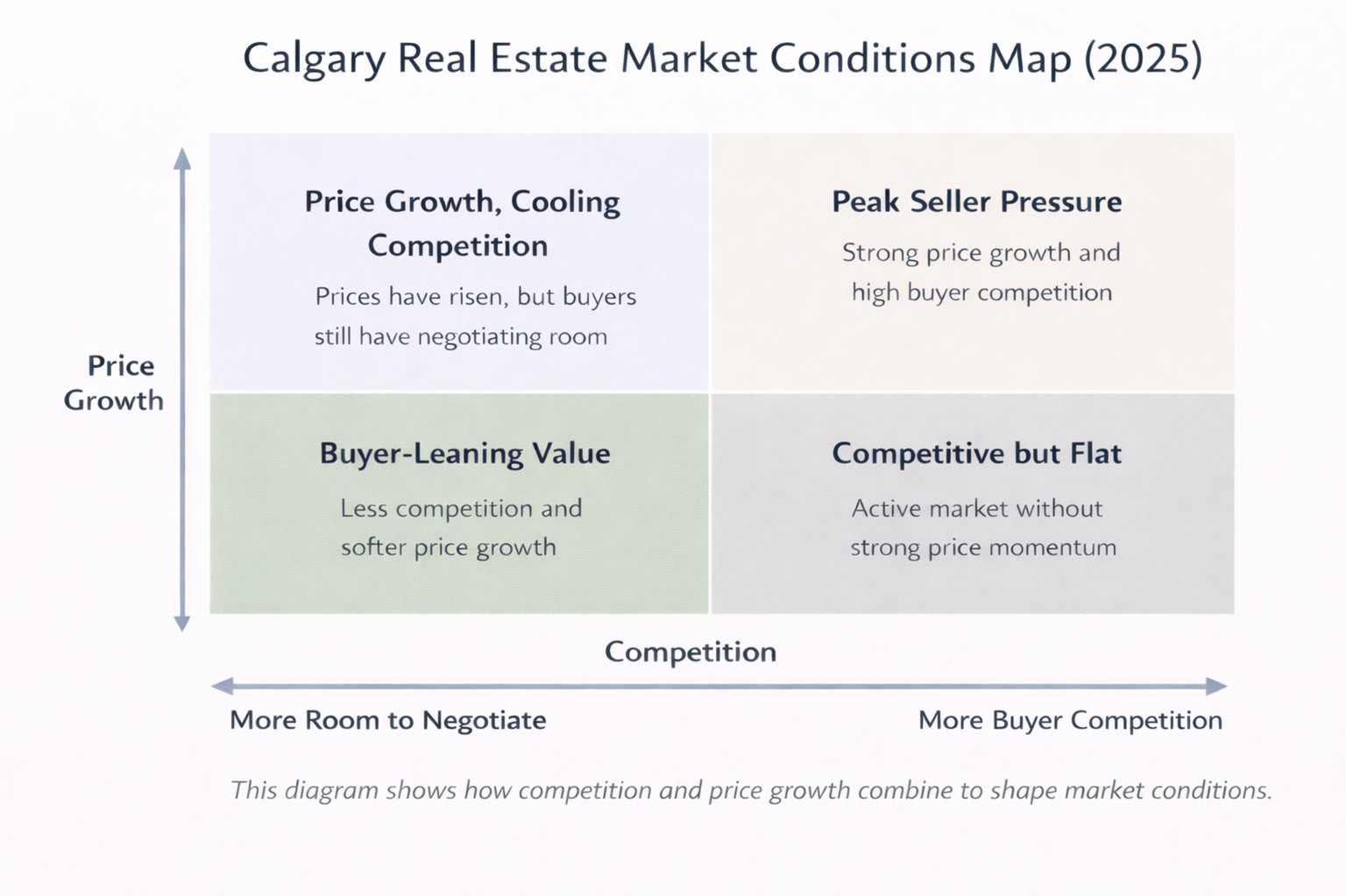
A Simple Way to Think About the Market
Rather than thinking in technical terms, it helps to look at communities through two simple lenses: how competitive they were, and whether that competition translated into price movement.
When you combine those two ideas, most communities fall into one of four broad patterns as illustrated in the Real Estate Market Conditions map:
- Peak seller pressure — strong competition combined with clear price growth.
- Price growth with cooling competition — prices moved earlier, but buyer pressure eased, giving buyers some negotiating room despite higher values.
- Buyer-leaning value — softer competition and limited price follow-through, creating more choice and flexibility for buyers.
- Competitive but flat — active markets where homes still sold, but without meaningful price acceleration.
None of these categories are “good” or “bad” on their own. They simply describe how leverage showed up — and for whom.
How This Played Out for Semi-Detached Homes in 2025
When we narrow the lens to semi-detached homes, those same dynamics show up in different ways across communities.
The seller-side leaders were defined by scarcity and follow-through: tight inventory relative to sales pace, steady absorption, and firm negotiation outcomes — sometimes reinforced by late-year price momentum.
The buyer-side leaders were defined by selection and patience: higher inventory relative to sales pace, softer absorption, longer decision windows, and more room on terms — regardless of what prices did later.
Same city, same subtype — different leverage depending on the community.
A Final Thought
There’s no single “right” move in Calgary real estate — especially when you narrow the lens to one property subtype. But understanding how your community behaved in 2025 puts you in a better position to plan timing, pricing, and expectations.
If you’re curious how your specific neighbourhood fits into this picture — or how your semi-detached home would likely position today — I’m always happy to walk through it with you.
Want a data-backed read on your community? You can reach me any time.