
Calgary detached housing in September 2026 is best understood by looking beyond the headline price. This report combines official CREB® city-wide and district statistics with the supplied Pillar 9™ listing records for the governed price-range new-listing and Active-only counts. It examines the 13-month trajectory, price-range divergence, district supply, and practical implications for buyers and sellers.
Executive Summary
Calgary detached homes finished September with 3.31 months of supply, placing the segment in balanced market conditions under the governed framework. Sales totalled 896, +4.4% year over year, while official new listings were 1,726, -9.3%. Inventory stood at 2,968, a 7.28% decrease from a year earlier, and the benchmark price was $739,400, -0.9%.
The price-range evidence shows that activity is not distributed evenly: Under $500,000 recorded the strongest sales year-over-year result at +26.7%, while $700,000–$799,999 recorded the weakest at -6.3%. The largest current Active-only listing count in the supplied listing records was in the $600,000–$699,999 range, with 583 listings. District conditions also differ materially, from 2.73 months of supply in West to 5.61 in North East.
For buyers and sellers, the important conclusion is that the segment-wide dashboard is a starting point rather than a complete description of competition. Price range and district can materially change the available supply and recent price direction. The next reports should be watched for changes in the balance between sales, inventory and months of supply, and for whether today’s price-range and district differences widen or narrow.
Detached Market at a Glance
How the Detached Market Is Changing
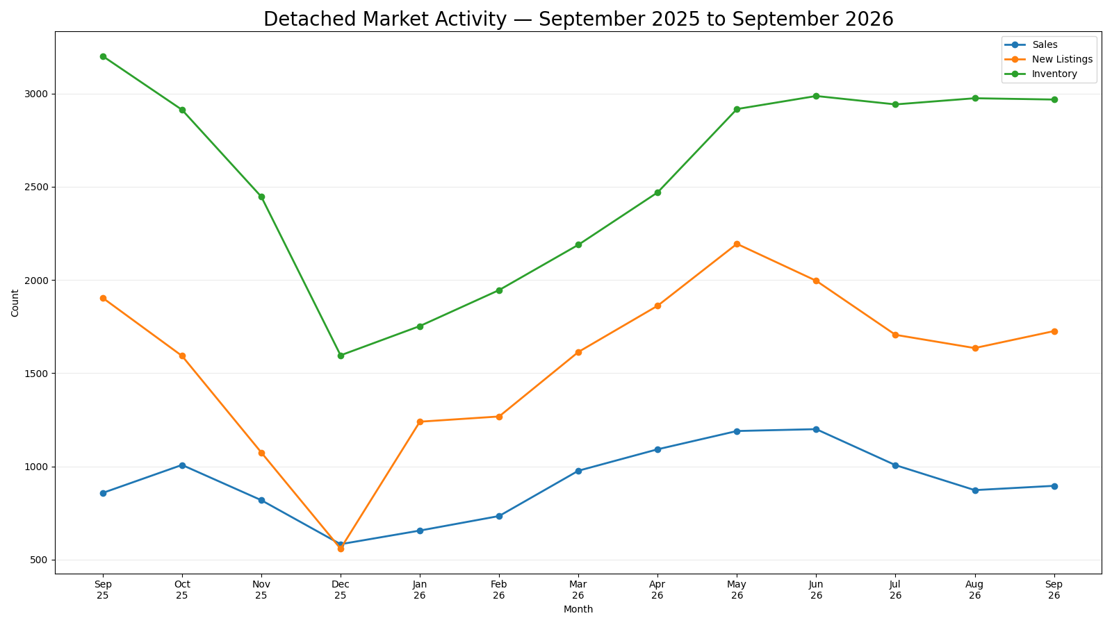
The 13-month detached trajectory shows a clear seasonal rise in activity through the first half of 2026 followed by slower late-summer and September conditions. Sales moved from 656 in January to a 2026 high of 1,200 in Jun 2026, then eased to 873 in August before finishing September at 896. New listings expanded more strongly during the spring, reaching 2,194, and then moved lower before September. Inventory followed the accumulation of listings, rising from 1,753 in January to a 2026 high of 2,987, and ended September at 2,968.
The year-over-year comparison adds context to that trajectory: September sales were +4.4%, new listings were -9.3%, and inventory was -7.3%. Months of supply measured 3.31, -11.2% year over year. These measures should be read together. A lower sales count does not automatically mean supply is expanding if inventory and new listings are also falling, while stronger sales can tighten the market if available inventory does not keep pace. September’s benchmark price of $739,400 was -0.9% from a year earlier, providing a price outcome alongside the activity and supply measures.
The trajectory therefore describes how the segment arrived at its current supply position without requiring an external explanation for the seasonal changes. The key analytical question for coming months is whether sales and inventory continue to move in a way that tightens or loosens the current balanced market position. Reading the full sequence also prevents a single monthly change from being mistaken for the entire trend, because the current supply position reflects the cumulative movement of sales, listings and inventory across the year.
Where the Detached Market Is Diverging
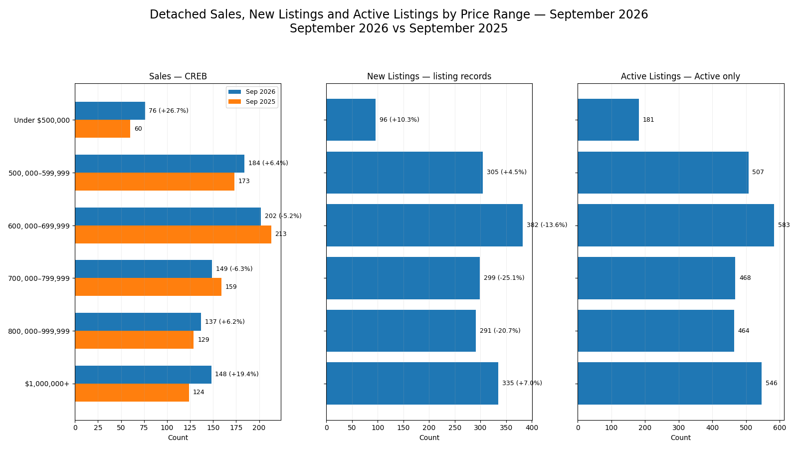
Price-range evidence shows that Calgary detached activity is not moving uniformly. Official CREB sales ranged from 76 to 202 transactions across the six governed bands in September, and their year-over-year changes varied from -6.3% to +26.7%. The strongest sales comparison was Under $500,000 at +26.7%; the weakest was $700,000–$799,999 at -6.3%. Listing-derived new listings add a second view of current supply entering the market.
The six bands totalled 1,708 new listings in the supplied records for September, compared with 1,900 in September 2025. Their year-over-year direction is not identical across ranges: the strongest new-listing change was +10.3%, while the weakest was -25.1%. Current Active-only listing counts also vary considerably, with the largest count of 583 in $600,000–$699,999. Those Active listings are a listing-level snapshot and are not the same measure as official CREB Inventory.
The mixed-source table and chart therefore answer different questions without substituting one dataset for the other: CREB supplies the official sales evidence and headline market measures, while the listing records show the governed price-range new-listing and Active-only counts. The most useful interpretation is the pattern of relative concentration rather than a single price band being labelled strong or weak. A range can show better sales performance while still carrying substantial active choice, or weaker sales while new listing flow is also contracting. That distinction is important when comparing a specific home with the alternatives buyers are seeing in its price range.
| Price Range | Sales | Sales YoY | New Listings | New Listings YoY | Active Listings |
|---|---|---|---|---|---|
| Under $500,000 | 76 | +26.7% | 96 | +10.3% | 181 |
| $500,000–$599,999 | 184 | +6.4% | 305 | +4.5% | 507 |
| $600,000–$699,999 | 202 | -5.2% | 382 | -13.6% | 583 |
| $700,000–$799,999 | 149 | -6.3% | 299 | -25.1% | 468 |
| $800,000–$999,999 | 137 | +6.2% | 291 | -20.7% | 464 |
| $1,000,000+ | 148 | +19.4% | 335 | +7.0% | 546 |
Geographic Differences
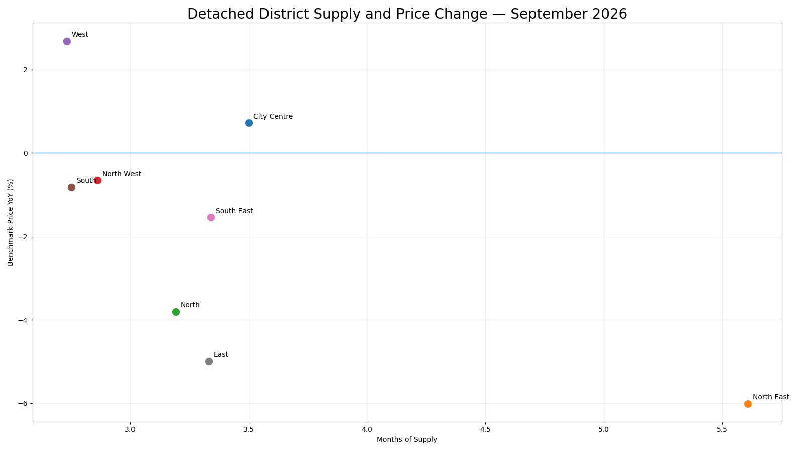
District conditions reinforce the need to narrow the analysis beyond the city-wide detached result. September months of supply ranged from 2.73 in West to 5.61 in North East, a substantial spread within the same property type. Benchmark-price performance also varied: West had the strongest year-over-year change at +2.7%, while North East had the weakest at -6.0%. These are related market-position measures, but the report does not treat months of supply as proof of what caused a district’s price change.
Sales and inventory counts provide the underlying scale behind each district’s supply position, and the full table keeps those exact official CREB values visible. For a reader evaluating a particular detached home, the main implication is that the segment-wide 3.31 months of supply can differ materially from the supply present in the relevant district. The district table should therefore be used to identify the appropriate local context before moving to individual comparable listings. The exact values remain available in the matrix so readers can verify the local contrast without relying on broad district labels or colour alone.
| District | Sales | Inventory | Months of Supply | Benchmark Price | Benchmark Price YoY |
|---|---|---|---|---|---|
| City Centre | 106 | 371 | 3.50 | $981,300 | +0.72% |
| North East | 88 | 494 | 5.61 | $556,600 | -6.01% |
| North | 138 | 440 | 3.19 | $640,200 | -3.80% |
| North West | 123 | 352 | 2.86 | $781,400 | -0.66% |
| West | 85 | 232 | 2.73 | $993,700 | +2.69% |
| South | 202 | 555 | 2.75 | $709,400 | -0.82% |
| South East | 119 | 398 | 3.34 | $698,900 | -1.55% |
| East | 33 | 110 | 3.33 | $476,200 | -4.99% |
What Is Driving the Detached Market
The internal market mechanics in September are best explained through the relationship between demand, listing flow and available supply. Official sales, new listings and inventory determine how much stock is available relative to the pace of transactions, which is reflected in the segment’s 3.31 months of supply. The 13-month trajectory shows that these components did not move in lockstep: spring listing and inventory growth was followed by slower late-summer activity, while September’s year-over-year changes differed across sales, new listings and inventory.
Price-range evidence adds another layer because listing flow and active choice are concentrated differently across bands. District evidence does the same geographically, with a wide spread between the lowest- and highest-supply areas. Those differences help explain why the detached market can produce a single city-wide benchmark result while individual price ranges and districts feel more or less competitive.
The governed evidence supports this interpretation of market balance, but it does not establish outside causes such as financing conditions, migration, construction activity or policy changes. Those factors may matter in the real world, but they are not demonstrated by the supplied monthly evidence and are therefore not presented here as causal conclusions.
What This Means for Buyers and Sellers
For buyers considering Calgary detached homes, September’s evidence argues for comparing options within the same price range and district before drawing conclusions from the segment-wide dashboard. A balanced market classification describes the overall supply-to-sales relationship, but the district spread and price-range Active-only counts show that choice is not distributed evenly. Where active supply is larger, buyers may have more alternatives to compare on price, condition and time on market. Where supply is lower, desirable listings can still face more competition even when the city-wide segment is not especially tight. The practical task is to identify the current competing listings and recent sales that most closely match the home being considered.
For sellers, the same evidence makes precise positioning important. The benchmark price is $739,400 with a -0.9% year-over-year change, but that city-wide measure does not set the value of an individual property. Sellers should look at the supply, sales pace and active competition in the relevant district and price range. A home entering a band with a large Active-only count may need to compete more directly for buyer attention than one in a range with fewer alternatives. Conversely, a lower district months-of-supply figure can improve relative positioning without guaranteeing a quick sale or a particular price.
For both buyers and sellers, the report is most useful as a hierarchy of evidence: city-wide detached conditions establish the broad context, the price-range and district sections identify where conditions diverge, and property-specific comparable analysis completes the decision process. The practical difference is a matter of market context rather than a forecast: more available choice can strengthen a buyer’s ability to compare alternatives, while tighter local supply can increase the importance of preparation and timely decisions.
What to Watch Next
Three indicators should be watched in the next detached report. First, track whether inventory moves faster or slower than sales. A sustained inventory decline with stable sales would reduce months of supply; inventory growth without matching sales would increase it. Second, monitor the price ranges with the largest September sales and new-listing changes. If those differences narrow, price-range divergence will be easing; if they widen, competition may become more uneven across the segment.
Third, watch the district spread between West and North East. A material convergence in their months of supply would indicate more uniform geographic conditions, while a persistent gap would keep local context especially important. These are evidence-based monitoring points rather than forecasts, and they should be assessed against the same official and listing-derived measures in the next monthly run.
Explore the Market in More Detail
Sources and Methodology
Headline market measures, the 13-month trajectory, official price-range Sales, and district Sales, Inventory, Months of Supply and benchmark-price measures come from the CREB® City of Calgary Monthly Statistics for September 2026. The supplied Pillar 9™ MLS® listing records are used only for the governed price-range New Listings, New Listings year-over-year change and current Active-only listing counts. Active Listings is not the official CREB Inventory measure. Market Status is based on official subtype months of supply using the report framework.